 |
|
|
|
|
Chapter 3
|
|||||||||||||||||||||||||||||||||||||||||||||||||||||
|
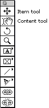
Figure 3-1. The Item and Content tools |
|
Item tool. The Item tool (or "Pointer tool"; though sometimes it’s called by its technical name: "the pointy-thingy"; see Figure 3-1) is the first tool on the Tool palette. It’s used for selecting and moving items (picture and text boxes, rules, and so on). You can use the Item tool by either choosing it from the Tool palette or by holding down the Command key while any other tool is selected (though you can’t select or work with multiple items with this Command key trick). I discuss all the things you can do with items later in this chapter, in "Manipulating Items."
Content tool. The second tool on the Tool palette is the Content tool (sometimes called the "Hand tool"). This tool is used for adding, deleting, or modifying the contents of a text or picture box or a text path. Note that its palette icon consists of a text-insertion mark and a hand. When you have selected this tool from the Tool palette, QuarkXPress turns the cursor into one of these icons, depending on what sort of box you have highlighted (as we see in Chapter 9, Pictures, the hand is for moving images around within a picture box).
|
Tip: Opaque versus Transparent Backgrounds. If you’ve been using XPress for a long time, you are probably used to QuarkXPress making text and picture boxes opaque whenever you select them with the Content tool. For some, this was always annoying because you couldn’t change the content in a box and see what was behind the box at the same time. Other people thought this was a great system because it let you edit the contents of a box free of any distractions caused by other page elements. Well, the first group won: Now in XPress 4, when you select the Content tool, boxes that have a background of None (that is, they’re transparent) remain transparent. If this bothers you, you’ve got two options. First, you can change the background of the text or picture box to White (I discuss how to do this a little later in this chapter). Second, you can write an e-mail letter to Quark and explain that you want a future version to offer an option between the two. |
|
Tip: Blurring Lines Between Tools. There have been more changes to the Item and Content tools in version 4. Apparently a lot of people had difficulty remembering which tool to use for certain tasks, so the folks at Quark loosened the reins a little. You can now perform several tasks that you could never do before.
It’s funny, but the people who were most upset by these changes were trainers, consultants, and writers. Most people who use XPress on a day-to-day basis hardly even think about these changes; they just make life a little easier. Note that almost all the other restrictions for these two tools remain: You still need to use the Content tool to import or edit text and to move pictures around within the picture box. |
The most basic action you can take with a page item in QuarkXPress is to select it. Once again: To select and modify an item itself, you generally need to use the Item tool. To select and modify the contents of a picture or text box, you need to use the Content tool.
In version 4, you can now select more than one item at a time with either the Item or the Content tool. However, the Content tool acts just like the Item tool when you have two or more items selected (the cursor even changes to the Item tool cursor). There’s two ways to select more than one item on your page: Shift-clicking and dragging a marquee.
Shift-click. You can select multiple items by Shift-clicking on them with either the Item or Content tool. If you have more than one item selected and you want to deselect one, you can Shift-click on it again (Shift-clicking acts as a toggle for selecting and deselecting).
| Tip: Grab Down Deep. There are plenty of times I’ve found that I need to reach through one or more objects on my page and grab a box or line that’s been covered up. Moving everything on top is a real hassle. Instead, you can select through page items to get hold of objects that are behind them. Hold down the Command-Option-Shift keys while clicking with either the Item or Content tool to select the object one layer down. The second click selects the object on the next layer down, and so on. |
I love the ability to drag a marquee out with the Item tool in order to select multiple objects. It’s fast, it’s effective, and it picks up everything in its path. However, sometimes it even picks up things you don’t want it to pick up. For example, let’s say you have an automatic text box on your page and then place some picture boxes on it. If you drag a marquee across the page to select the picture boxes, chances are you’ll select the text box, too. You may not notice this at first, but if you group the selection or start dragging it off into a library or someplace else, you’ll be taking the text box along for the ride. This spells havoc (press Command-Z quick to undo the last action).
So, just a quick lesson from people who’ve been there: Watch out for what you select and group. And if you do select more than you want, remember that you can deselect items by holding down the Shift key and clicking on them.
|
Tip: Deselecting En Masse. To deselect one or more objects, you typically need to click a white area on the page (someplace where there are no other objects). However, there’s a faster way: You can deselect every selected page item in one stroke by pressing Tab when the Item tool is selected. I find this really helpful when I’m zoomed in on the page and can’t tell what’s selected and what isn’t. When you have the Content tool selected, the Tab key means something different: if only one object is selected, the Tab key types a tab character. But if you’ve selected more than one object, the Content tool acts just like the Item tool, so the Tab key deselects them. |
|
Tip: Select All. There’s a third way to select more than one object on your page at a time. If you want to select all the page items, you can press Command-A. However, this only works when you have the Item tool selected. (When you have the Content tool selected, Command-A means "select all the text in a text box.") |
The name of the QuarkXPress game is page layout, so we’d better start laying out some pages. There are five kinds of items you can put on your page: text box, picture box, contentless box, lines, and text paths. I spend much of the rest of the book discussing how to put content inside these objects and what to do with it once it’s there, so I’d better spend some time now exploring the items themselves, how to make them, and how to edit them to suit your needs.
|
Figure 3-2. The item creation tools |
|
|
In this section, I discuss the various tools you can use to create page items. There’s more than ever in this version of the program, so many that the folks at Quark decided to hide some of them inside popout menus in the Tool palette (see Figure 3-2, as well as "Palettes," in Chapter 2, QuarkXPress Basics, for more information on how to move these tools in and out of the popout menus).
Note that because the Bézier drawing tools have their own set of problems and solutions, I’m going to hold off on discussing them until the next section.
|
Tip: Keeping Your Tools Around. After you use a tool (any tool other than the Zoom tool), the Tool palette automatically reverts back to either the Content or the Item tool (depending on which of the two you last used). This becomes a hassle if you want to use the same tool again. Instead, you can hold down the Option key as you select a tool. The tool remains selected until you choose another one. |
In earlier versions of XPress, when you wanted a box, you had to clearly specify what kind of box it was–a text box or a picture box–and you had to pick a different tool to create each. And that was it; there was no switching once you had drawn the box. What’s more, there were a slew of tools for making different-shaped picture boxes and only one (rectangular) for making text boxes.
But life is better now. XPress offers all the same tools for both text boxes and picture boxes, and although you still have to pick one or the other when drawing a box on your page, you can switch it from picture to text and back again. There’s even a new kind of box, called a contentless box, which I talk about in just a little bit.
Creating a box is simple: choose one of the box tools from the Tool palette, and then click and drag on your page. You can see exactly how large your box is by watching the width and height values on the Measurements palette. Note that you can keep the box square (or circular, if you’re using the Oval Text Box tool or the Oval Picture Box tool) by holding down the Shift key while dragging.
All boxes–as items–have a number of basic attributes that you can display and change.
Of course, text boxes and picture boxes each have a few of their own characteristics, as well, and the Measurements palette and Modify dialog box both change to accommodate these differences.
Let’s take a quick look at some of these box attributes. I don’t cover them all in this section, but don’t worry: I cover them all by the time the chapter is through.
(There are several other items in the Modify dialog box and the Measurements palette, too–for instance, the scale of pictures, text runaround, and so on. I hold off discussing these until later in the book, mostly in Chapter 6, Type and Typography, Chapter 9, Pictures, and Chapter 11, Where Text Meets Graphics.)
|
Tip: That Ol’ Modify Dialog Box. I use the Modify dialog box for text boxes, picture boxes, lines, and text paths so often that I’m glad to have some variance in how I get to it. You can open the Modify dialog box for a page element in several ways.
Once you’re in the dialog box, you can tab through the fields to get to the value you want to change. After a while, you memorize how many tabs it takes to get to a field, and you can press Command-M, Tab, Tab, Tab, Tab, Tab, type the value, press Return, and be out of there before QuarkXPress has time to catch up with you. That’s when you know you’re becoming an XPress Demon. |
|
Figure 3-3. Bounding box and position |
|
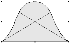
Position and size. All boxes are positioned by their upper-left corner. This point is called their origin. The first two fields in the Modify dialog box and the Measurements palette are Origin Across and Origin Down. However, unless your box is rectangular, the origin is not necessarily where you think it is because the origin is based on the box’s bounding box–the smallest rectangle that could completely enclose the item (see Figure 3-3).
Note that if you’ve rotated the box, it still thinks of the original upper-left corner as its origin. So if you rotate 90 degrees counterclockwise, the lower-left corner (formerly the upper-left corner) is still the origin point.
The size of the box is then specified by its width and height (the distances to the right and down from the origin). These values, too, are calculated from the item’s bounding box.
|
Tip: Quick, Accurate Boxes. Some people tend toward a visual approach to creating and sizing boxes in QuarkXPress, while others work with a more mathematical or coordinate-based method. Fortunately, both work equally well. You can click and drag page elements out to the size you want them, if you prefer to make a decision based on seeing what it looks like. Or, if you’re working on a grid, you can draw a box to any size, and then jump into the Measurements palette or Modify dialog box to specify the exact origin coordinates, the width, and the height. |
|
Tip: Moving an Item’s Origin. One of the features I’ve always coveted in Adobe PageMaker is the ability to set the origin of a page element from a number of locations, rather than just the upper-left corner. Until QuarkXPress does the same, I can only offer a somewhat weak workaround for specifying alternate origins: use the built-in math functions. To set the right side of a box at a specific location, subtract the width of the box from the location’s coordinate. For example, to set the right side of a 12-pica-wide box at the 2.75-inch mark, type "2.75"-12p" into the x-origin field of the Measurements palette. Similarly, to set the location for the center of a box, divide the box width by two and then subtract it from the coordinate. For example, if you want the center of a 16-pica-wide box to be at the 18-centimeter mark, you can type "18cm-16p/2". (Remember that XPress does division first, then the subtraction). |
Background color. Every picture and text box has a background color, or can have a background set to None. Any background color other than None and White can be set to a specific tint. Note that zero percent of a color is not transparent; it’s opaque white.
A box can also have a blend of two colors in its background (I discuss creating, editing, and applying colors and blends in Chapter 12, Color). Both background colors and blends are specified in the Modify dialog box.
|
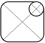
Figure 3-4. Corner radius defines how rounded the corners are |
|
Corner Radius. The Corner Radius attribute is applicable to all boxes except those made with the Bézier tools (which I discuss later in this chapter). The Corner Radius feature in the Modify dialog box lets you set how rounded the corners should be (see Figure 3-4). (On the Beveled Corner box tools, it sets the size of the bevels.) In fact, because you can turn a rectangular box into a rounded-corner box just by setting its Corner Radius, I think there’s little reason to ever use the Rounded Corner box tools.
Besides, and to be frank, rounded-corner boxes are one of the most obvious giveaways that you created your document using a Macintosh or Windows machine. Some of the all-time worst designs that have come off of a desktop computer use rounded-corner picture boxes. I really dislike them. But, then again, it’s your design, and you can do what you like with it.
Columns. While the previous several items were applicable to all boxes, the Columns attribute is text-box-specific. Text boxes can be divided into a maximum of 30 columns. Each column’s size is determined by the size of the gutter (blank space) between columns. You can set the gutter width only in the Modify dialog box, although you can set the number of columns in either this dialog box or the Measurements palette.
Note that you cannot have columns with negative widths: the number of columns you can have is determined by the gutter width. For example, if your gutter width is 1 pica and your text box is 20 picas wide, you cannot have more than 20 columns; however, that many columns would leave no room for text.
Text Inset. The last attribute particular to text boxes is Text Inset. The Text Inset value determines how far your text is placed inside the four sides of the text box. For example, a Text Inset value of zero places the text right up against the side of the text box. A text inset value of "3cm" places the text no closer than 3 centimeters from the side of the box.
The default setting for text inset is 1 point. The reason: Because the folks at Quark noticed that text set flush against the side of a box is hard to read. If you find this as obnoxious as I do, you can change this default setting for your text boxes to zero or any other value (see "Changing Defaults," in Chapter 2, QuarkXPress Basics). Or you can do it a box at a time in the Modify dialog box.
Note that there are XTensions, like XPertTools Volume 2, that let you specify the Text Inset value for each of the four sides rather than simply one value for all sides. That can be very helpful in certain situations.
|
Figure 3-5. Changing box type |
|
Contentless boxes. It took 10 years for the engineers at Quark to figure out that we sometimes put boxes on our pages not to contain text or a graphic, but just for the sake of a background color (sometimes known as a tint build). In the past, you had to use a picture box or a text box to do this, with annoying side effects. Empty picture boxes display a big "X" in them; and text boxes, when covered by other boxes, display an overset mark, even if there’s no text in them to overset.
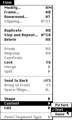
Fortunately, QuarkXPress now offers contentless boxes, which you can use just for this purpose. To get a contentless box, select a picture or a text box and choose None from the Content submenu (under the Item menu).
Two other things to note about contentless boxes, too. First, they take up slightly less space on disk (though this only really makes a difference if you have hundreds of them in your document). Second, contentless boxes draw on-screen faster because XPress doesn’t have to think about each one, whether it has content or not, and so on.
|
Tip: Adding Contentless Boxes. If you find yourself frequently converting picture or text boxes to contentless boxes (by selecting None from the Content submenu), you should just draw your boxes with the contentless box tools. Unfortunately, there are none in the Tool palette. Or are there? Open the Tool tab of the Document Preferences dialog box (see "Changing Default Preferences" in Chapter 2, QuarkXPress Basics), and Command-click on the Default Tool Palette button. When you click OK to leave the dialog box, XPress adds contentless tools to your palette. |
The Tool palette contains four tools to draw lines and arrows on your page. To be precise, you really only draw lines, but those lines can be styled in several fashions, and they can have arrowheads and tailfeathers. You can create a line with any thickness between 0.001 point and 864 points (that’s a pretty thick line–more than 11 inches thick), at any angle, and apply various styles and colors to it. Like boxes, you can view and change these attributes in the Modify dialog box and–for some–the Measurements palette.
Two of the tools are based on Bézier curves, and I discuss them in "Bézier Boxes and Lines," later in this chapter. The other two tools are the Diagonal Line tool and the Orthogonal Line tool.
Diagonal Line tool. The Diagonal Line tool can make a line at any angle. If you hold down the Shift key while dragging out the line, you can constrain the line to 45 or 90 degrees. Don’t worry if the line looks jaggy on-screen; that will smooth out when the file is printed.
Orthogonal Line tool. For those of you who aren’t in arm’s reach of a dictionary, orthogonal means that the lines you draw with this tool can only be horizontal or vertical. This tool is somewhat redundant, given that you can make orthogonal lines easily with the Diagonal Line tool and the Shift key. However, I guess it’s nice to have this option.
Line weight. I always use the word "weight" or "thickness" rather than "width," which is what QuarkXPress uses to describe lines. (When I talk about the width of horizontal lines, people often think I’m talking about length.) The line thickness is centered on the line. That is, if you specify a 6-point line, 3 points fall on one side of the line, and 3 points fall on the other side.
This value appears in three places: the Style menu, the Modify dialog box, and the Measurements palette. Even better, you can press Command-Shift-\ (backslash) to bring up the Line Width field in the Modify dialog box. Table 3-1 shows several other ways to change a line’s weight with keystrokes. (You can use the same keystrokes to specify type size.)
| Table 3-1 | |
| To... | Press... |
| Increase weight by preset amount | Command-Shift-period |
| Increase weight by one point | Command-Shift-Option-period |
| Decrease weight by preset amount | Command-Shift-comma |
| Decrease weight by one point | Command-Shift-Option-comma |
|
Tip: Don’t Use Hairlines. You have the option to select Hairline when choosing a line thickness. Don’t. Traditionally, a hairline is the thinnest possible line you can print. On a low-resolution desktop printer, this is pretty thin, but on an imagesetter it’s often too small to be seen. When you print your document, QuarkXPress actually replaces hairlines with 0.25-point rules so you don’t get caught in this trap. However, sometimes the program goofs up: When XPress 4.0 first shipped, many users went ballistic because the program had stopped catching and replacing hairline-width rules. Quark quickly fixed the "problem," so current versions work just fine. Nonetheless, it’s always better to specify the thickness of your lines rather than rely on a program to do it. |
Color and shade. You can set the line’s color to any color in the document (see Chapter 12, Color), then tint it to any value from zero to 100 percent, in 0.1-percent increments (zero percent is white). These specifications are available in the Modify dialog box, the Colors palette, or the Style menu.
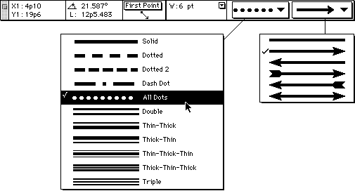
Style and endcaps. Lines don’t have to be boring; spice them up with a new style, or add endcaps to turn them into arrows. You can choose one of 11 different line styles and one of six endcap combinations by selecting them from two popup menus in the Modify dialog box, the Style menu, or the Measurements palette (see Figure 3-6).
|
Figure 3-6. Line styles |
|
Even though you have six endcap styles to choose from, the choice really comes down to either with arrowheads and tailfeathers, or without them. You can’t edit the style of these endcaps, so you’re stuck with what’s built into the program.
Note that if you choose an arrowhead that points to the right, the arrowhead you get might point to the left. The reason is that the arrowhead style pointing to the right actually means "put an arrow at the end of the line." XPress remembers how you drew the line–where you first clicked is the beginning of the line, and where you let go of the mouse button is the end. (This is different from the way it worked in earlier versions.) If the arrow is pointing the wrong way, just select the opposite direction in the Arrowhead popup menu.
The ability to put text on a path is, for many people, alone worth the price to upgrade from version 3. In the past, you had to switch to an illustration program to create this effect, then save the text as a graphic, then import it into a picture box...and then if you wanted to edit it, you had to go back to the original program, and so on. Well, no longer!
QuarkXPress 4 offers four text-path tools that appear and act almost identically to the four line tools that I just discussed. While the two Bézier text-path tools are the ones you will probably use the most often, I discuss those in the next section ("Bézier Boxes and Lines"). Let’s start, instead, with the two simple text-path tools: the Diagonal Text Path tool and the Orthogonal Text Path tool. And then let’s look at how you can customize the text on the path to get the effect you’re looking for.
|
Tip: Converting Lines to Text Paths. Just as you can convert a picture box to a line box and back again, you can make any regular line a text path by choosing Text in the Content submenu (under the Item menu). What this literally means is that lines can have content, too. In fact, in many ways a text path acts just like a text box that holds just a single line of text. To change a text path to a regular line, choose None from the Content submenu. |
Drawing with the text-path tools. When you draw a path with a text-path tool, XPress immediately switches to the Content tool, letting you type along the line (see Figure 3-7). If you hold down the Shift key when you’re drawing the path, the line is constrained to a horizontal, vertical, or 45-degree angle (which makes the Orthogonal Text Path tool a bit redundant).
|
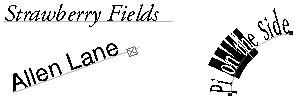
Figure 3-7. Drawing with the text-path tools |
|
If you want to edit the text on the path, watch the cursor carefully when you click or drag over the path. Depending on where you place the cursor, the cursor’s appearance changes. If you put it directly over the line, you may get the Edit Segment cursor (I cover this in "Bézier Boxes and Lines," later in this chapter). If you put it over an endpoint, you’ll get the Move Point cursor. It’s only over certain parts of the line that you see the Edit Text "I-beam" cursor.
Once again, text on a path acts just like it’s in a text box, so you can use all the text editing features that I discuss in Chapter 5, Word Processing, Chapter 6, Type and Typography, and Chapter 7, Copy Flow. In fact, when you select the text path with the Content tool, the Measurements palette appears almost exactly the same as it does with text boxes; with the Item tool, the palette appears as though you had a line selected.
|
Figure 3-8. Changing the line style on text paths |

|
Line width and style. By default, the text paths themselves have a thickness of Hairline and a color of None, which makes them invisible. The text on the path, of course, is a different matter. Every now and again, primarily for special effects, you’ll want to change the line’s style and weight (see Figure 3-8). You can do so with the same features as with normal lines: the Style menu, the Measurements palette, and the Modify dialog box.
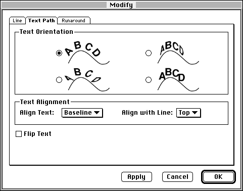
Text Orientation. Text paths have a special tab in the Modify dialog box that lets you specify text-path options (see Figure 3-9). The first control you have over text on a text path is the orientation of the text. There are four options, though I should note that none of these have any effect on text paths you create with the Diagonal or Orthogonal Text Path tool. They only affect Bézier text paths. In fact, you can’t even convert a diagonal or orthogonal text path to a Bézier curve in order to use these; rather, you have actually create a new path with the Bézier text-path tools.
|
Figure 3-9. Text path options |
|
|
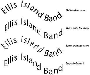
Figure 3-10. Text orientation |
|
|
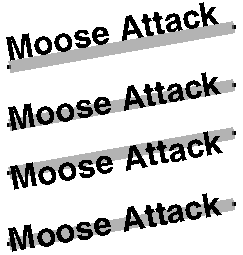
Figure 3-11. Text alignment |
|
Text Alignment. The next control on the Text Path tab of the Modify dialog box is Text Alignment, which lets you specify what part of the text should align with what part of the path. For instance, the default setting is for the baseline of the text to align with the top of the line (see Figure 3-11). Of course, because the default line is only 0.25 point thick, there is very little difference between aligning to the top or the bottom of the line. If you make the line thicker, however, this makes a difference. (You can make the line thicker and still set the Color to None, making it invisible.)
If you set the Align Text popup menu to Ascent, however, then XPress moves the text down so that the highest ascender in the typeface (like the top part of a lowercase "k") aligns with the line. You can also choose Center (which centers the font’s lower-case characters–its x-height–on the line) or Descent (which aligns the lowest descender of the font–like the bottom part of a lowercase "y"–to the line).
Which setting you should choose depends entirely on your situation, the text, and the type of curve. I find that it’s often worth testing two or three different settings here until I get the effect I like most (remember the Apply button so you don’t have to keep leaving the dialog box each time you try a new setting).
|
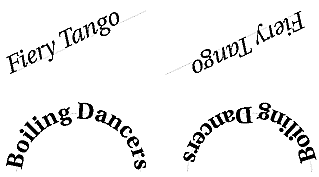
Figure 3-12. Flip Text |
|
Flip Text. The last control in the Modify dialog box that applies to text paths is Flip Text, which doesn’t so much flip the text as much as it flips what XPress thinks of as the path. That is, when this is turned on, QuarkXPress starts the text from the last point on the path instead of the first, and the top and bottom sides of the path are reversed (see Figure 3-12). The result is usually a mirror image of the original–except that XPress doesn’t mirror the text itself, only the text flow. I find that when I use Flip Text, I almost always have to adjust the Text Alignment settings to accommodate it.
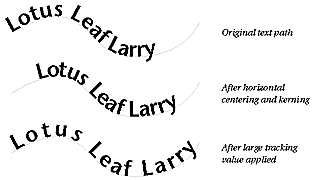
Tip: Positioning the Text on the Curve. As I’ve said before, text on a path acts the same as text in a text box. This means that, if you don’t like the position of the text on your path, you can use the settings in the Paragraph Formats dialog box, like Left Indent and Horizontal Alignment. For example, if you want text to be centered on the path, just place the cursor in the text and change the Alignment to Centered (Command-Shift-C). You can also add or remove space between characters along the path using kerning and tracking (see Figure 3-13). I discuss all these typographic controls in Chapter 6, Type and Typography. |
For most people working in desktop publishing, the addition of Bézier curves to QuarkXPress version 4 is truly a joyous event. It means that we don’t have to leave QuarkXPress and open an illustration program just to set some text on a path, or to draw a simple shape such as a heart to put a graphic in. Creating these kinds of elements has always been a hassle, and editing them was even worse. Now, XPress’s tools make editing paths and shapes much easier.
If you are familiar with the Bézier controls in programs such as Adobe Illustrator or Macromedia FreeHand, you will find the controls in XPress 4 to be similar. As in those programs, the Bézier shapes are drawn with a Pen tool. And as in those programs, there are anchor points with handles to control the curves of the Bézier shapes. However, there are some features in QuarkXPress that are unique. This means that you may not be able to pick up the QuarkXPress Pen tools and start drawing immediately. You may need to retrain your fingers for the QuarkXPress tools.
If you have never worked with Bézier tools you may find them a little daunting. More than one student has given up learning the "dreaded Pen" tool in desktop illustration programs. Hang in there! Mastering the Bézier tools in QuarkXPress enables you to create the most sophisticated and interesting artwork and designs.
...to be continued in print
|
About this Web Site | Back to Opening Page |